
Communication Dashboard
Helping Teams Reduce Missed Messages and Respond Faster
UI/UX
Dashboard
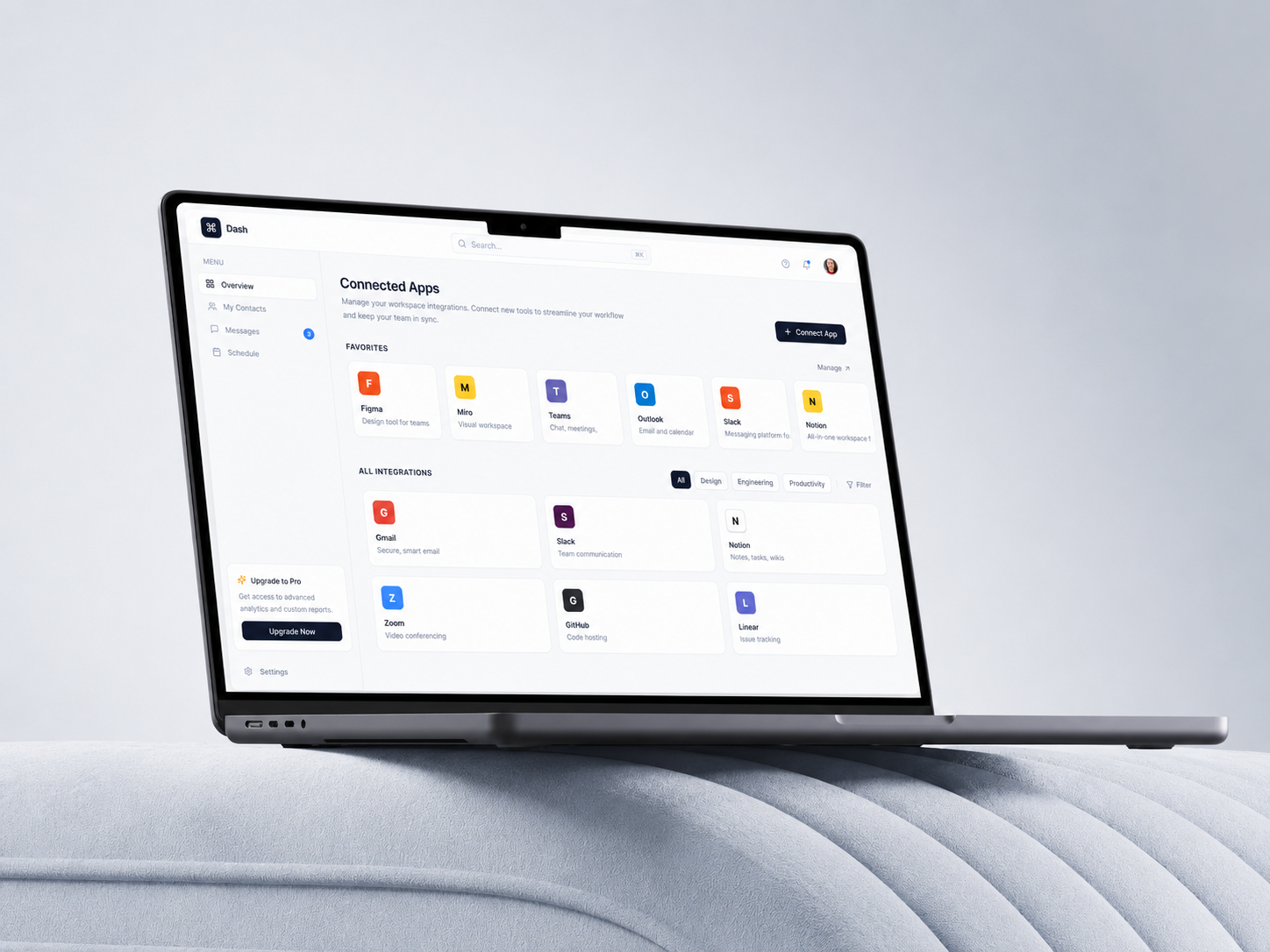
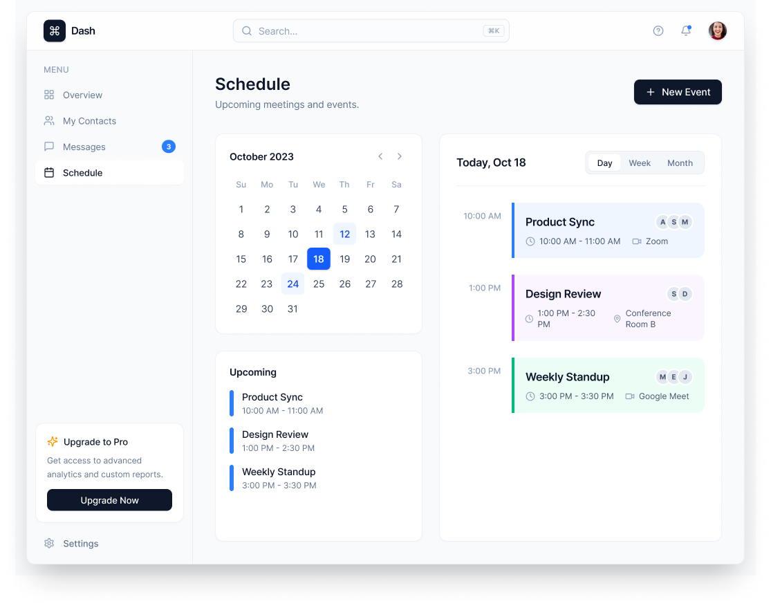
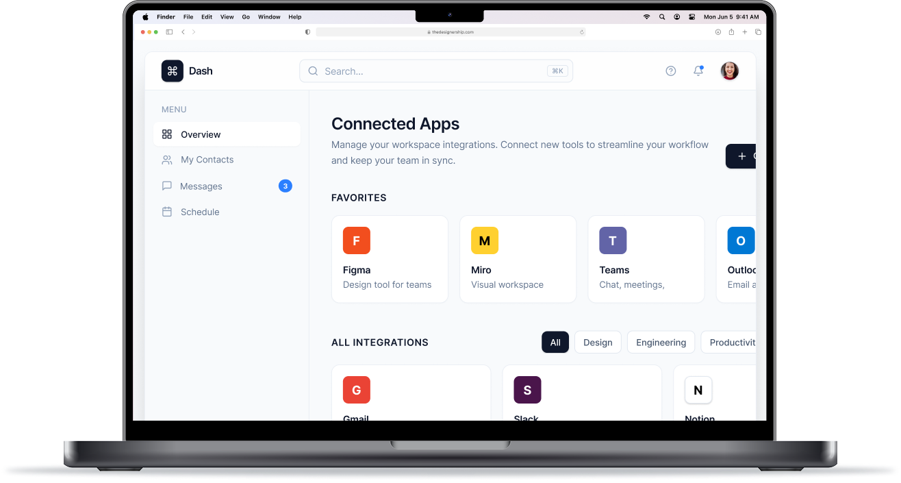
Communication — Dashboard
A dashboard that turns scattered team communication into one clear view of what needs attention now.
Role and scope
- UI/UX design
- Visual direction
- Interaction design
- Timeline: 3-6 weeks
Problem Statement
- How might we help teams reduce missed messages, clarify ownership, and respond faster when communication is spread across multiple tools?
- Important messages can get buried across tools, creating missed follow-ups and delayed responses.
Audience
Hybrid teams, product teams, managers, and knowledge workers managing conversations across multiple tools.
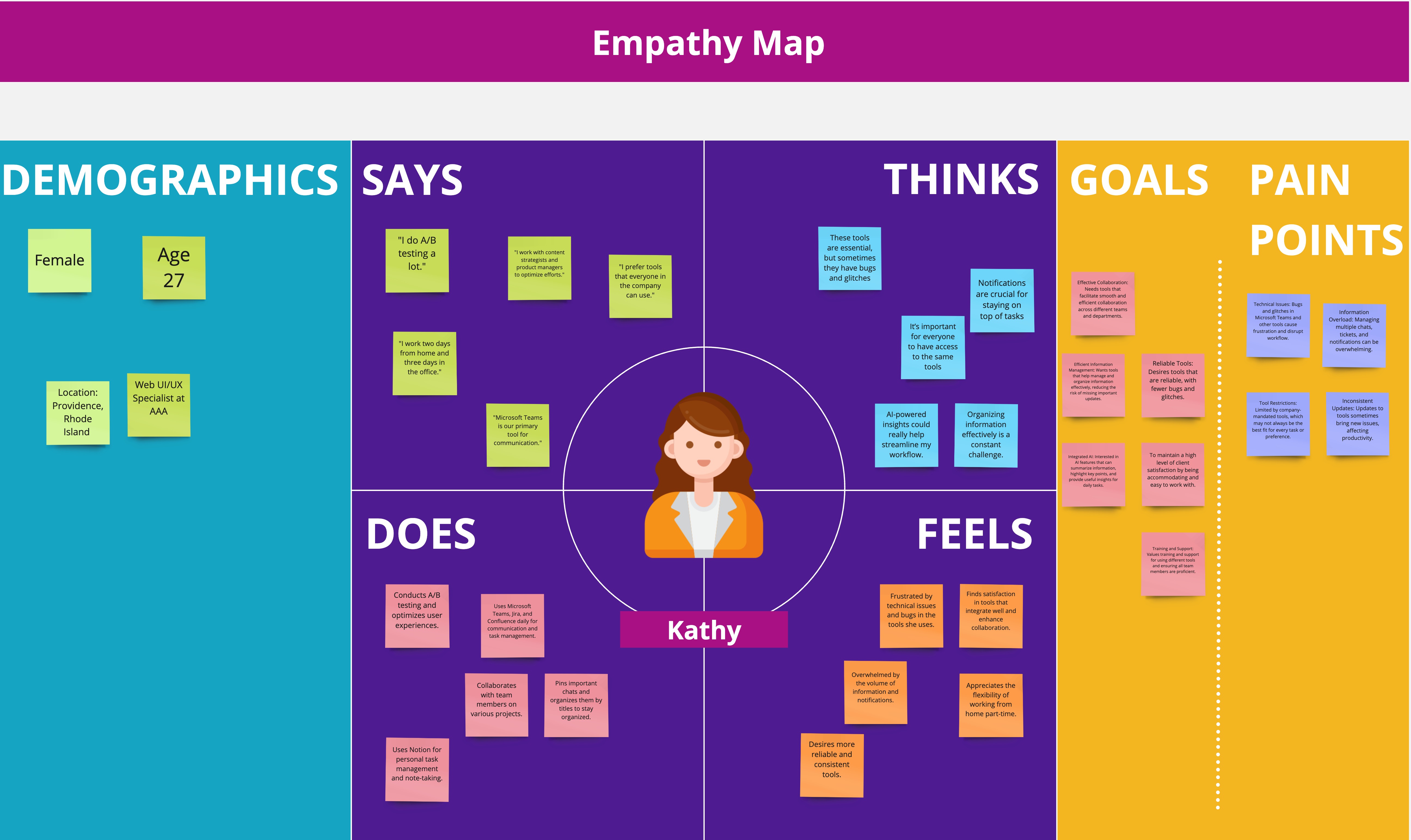
Research
Quantitative: Survey
.png)
Qualitative: Interview
.png)
Ideation
.png)
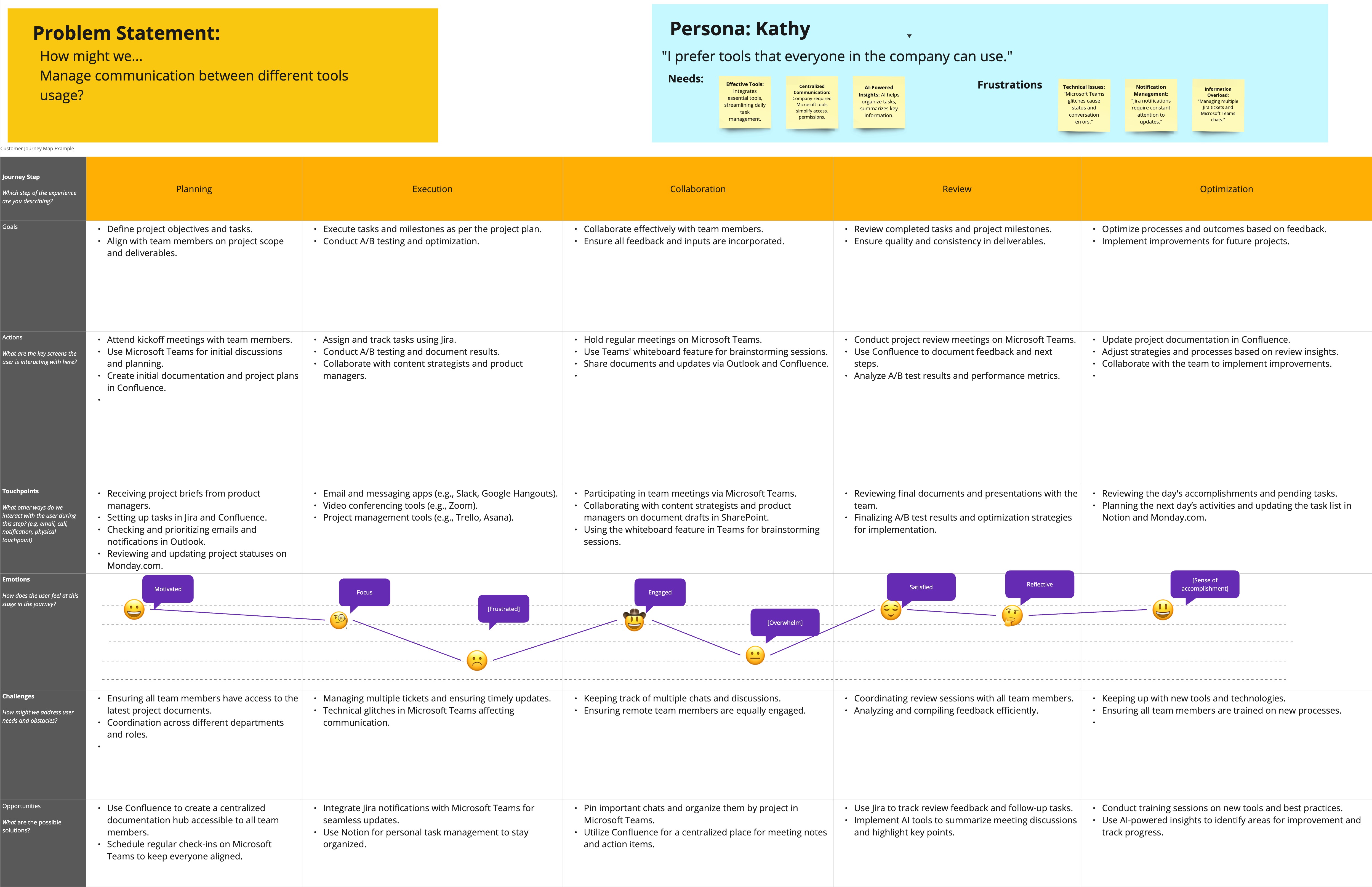
Design
- Information hierarchy: built around Triage → Ownership → Trends
- Core components: ownership view (who’s responsible, handoffs) & Health metrics (response time, backlog, reopen rate)
- Interaction patterns: quick filters, saved views, and clear “next best action” CTAs
Outcome
The landing page improved first-screen comprehension and reduced friction in the path to sign up.
- Faster triage: time-to-identify urgent threads 48s → 21s
- Fewer misses: missed/late responses 19% → 14% (-28%)
- Faster response: median first response 2h 10m → 1h 42m (-22%)
Tools
Figma, Mural, SurveyMonkey, Zoom Recording, Claude
More Cases

Every project starts with a story. I turn those stories into digital experiences that feel effortless and expressive.