
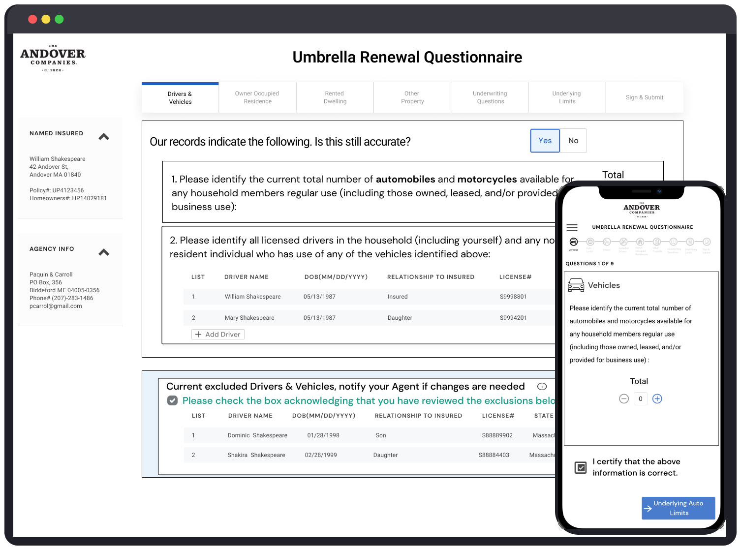
Umbrella Renewal Questionnaire
Product questionnaire form for policyholders to verify and input data for continuous insurance coverage.
URQ
Form Experience
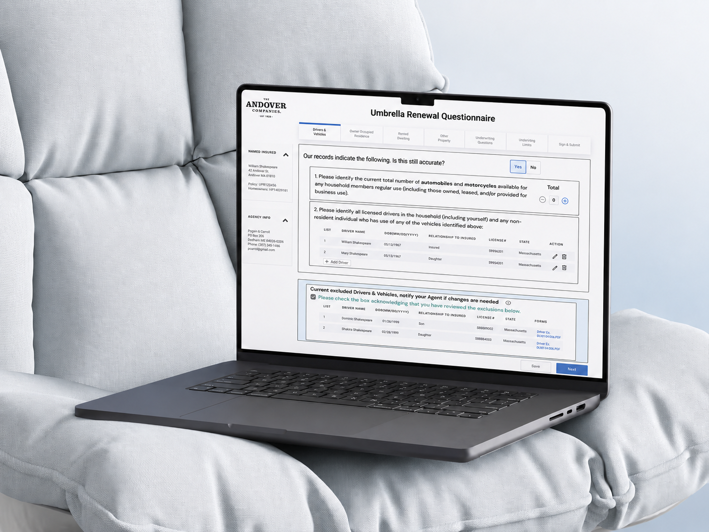
Umbrella Renewal Questionnaire— Product Form
Redesigned a paper-based renewal questionnaire into a guided, step-by-step digital flow, validated through research and A/B testing.
Role and Scope
- UI/UX design
- Visual direction
- 1 month timeline
- Hand-off and documentation
Problem Statement
- Existing URQ was paper-based → higher friction and harder verification (validated via paper testing + user pain points).
- How might we streamline URQ so policyholders complete it accurately and on time, while reducing manual verification for employees?
.png)
Research
- Survey (65 responses): users prefer shorter forms, and quit when there are too many required fields / the form is too long.
- Interviews (5): preference for desktop on complex forms; biggest issues were confusing questions, unclear instructions/errors, navigation, length; strong preference for auto-filled data.
Design
- Designed desktop experience from the paper questionnaire, created a happy-path flow, and brainstormed via analogies analysis.
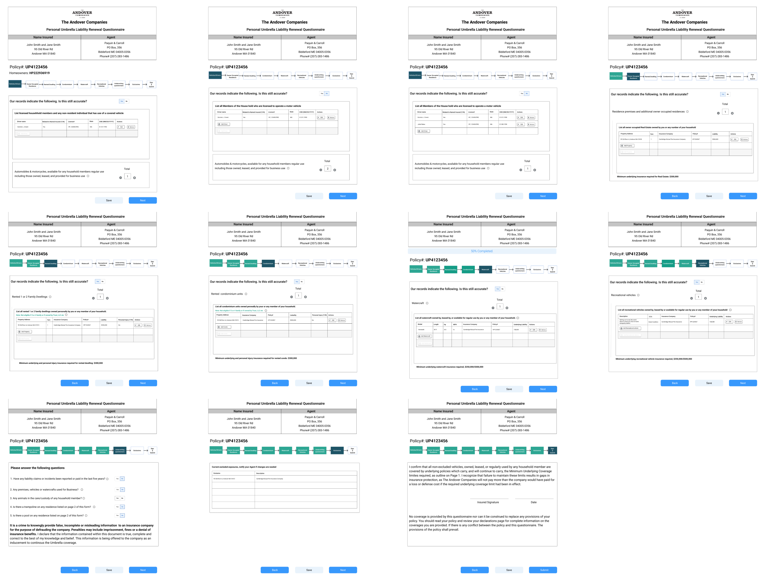
Validation: A/B Test
Version A: Step by Step
- Lower cognitive load, guided wayfinding, easier error correction, more mobile-friendly.
.png)
Version B: Scroll Page
- Faster for expert users but higher cognitive load, less mobile-friendly.
.png)
Design MVP
- Shipped direction: Step-by-step questionnaire with guided navigation/wayfinding and progressive validation.
Outcome
Step-by-step forms outperform long scroll experiences when complexity + accuracy matter (especially on mobile).
- Higher accuracy in responses by 17.5%
- Improved customer satisfaction by 14%.
- Increased conversions by 7%
Tools
Figma for design and prototyping, Miro for brainstorming, Affintiy diagram, and workshops. UserTesting for research. ChatGPT & Gemini for synthesising data.
More Cases

Every project starts with a story. I turn those stories into digital experiences that feel effortless and expressive.