
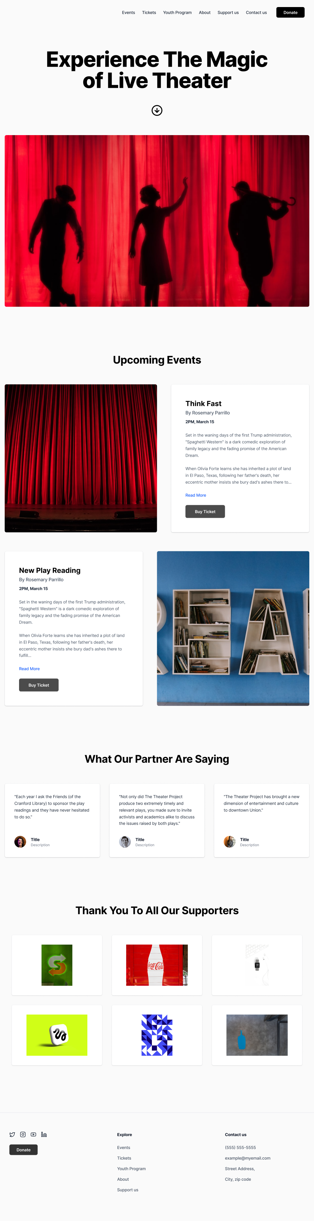
Theater Project
Homepage Redesign to Increase Ticket Sales
Landing Pg
UI Design
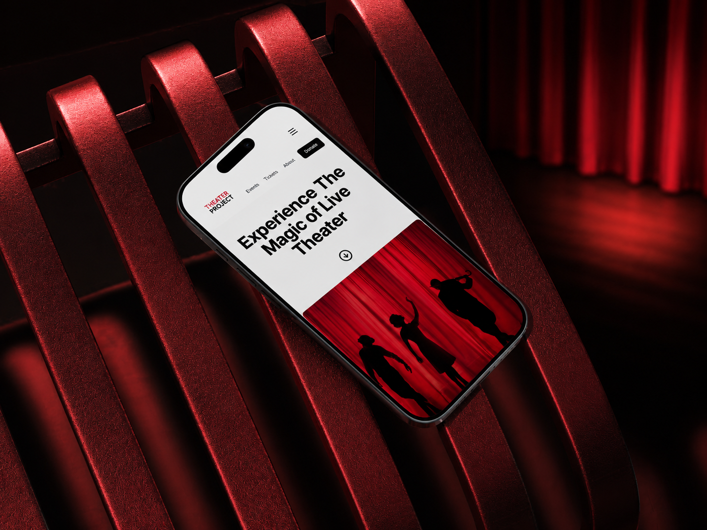
Theater Project— Product Landing Page
Homepage Redesign to Increase Ticket Sales
Role and scope
- UI/UX design
- Visual design
- Interaction design
- 2 weeks
Problem Statement
- Users reported the homepage felt hard to navigate, and analytics showed low conversion events despite steady traffic
Research
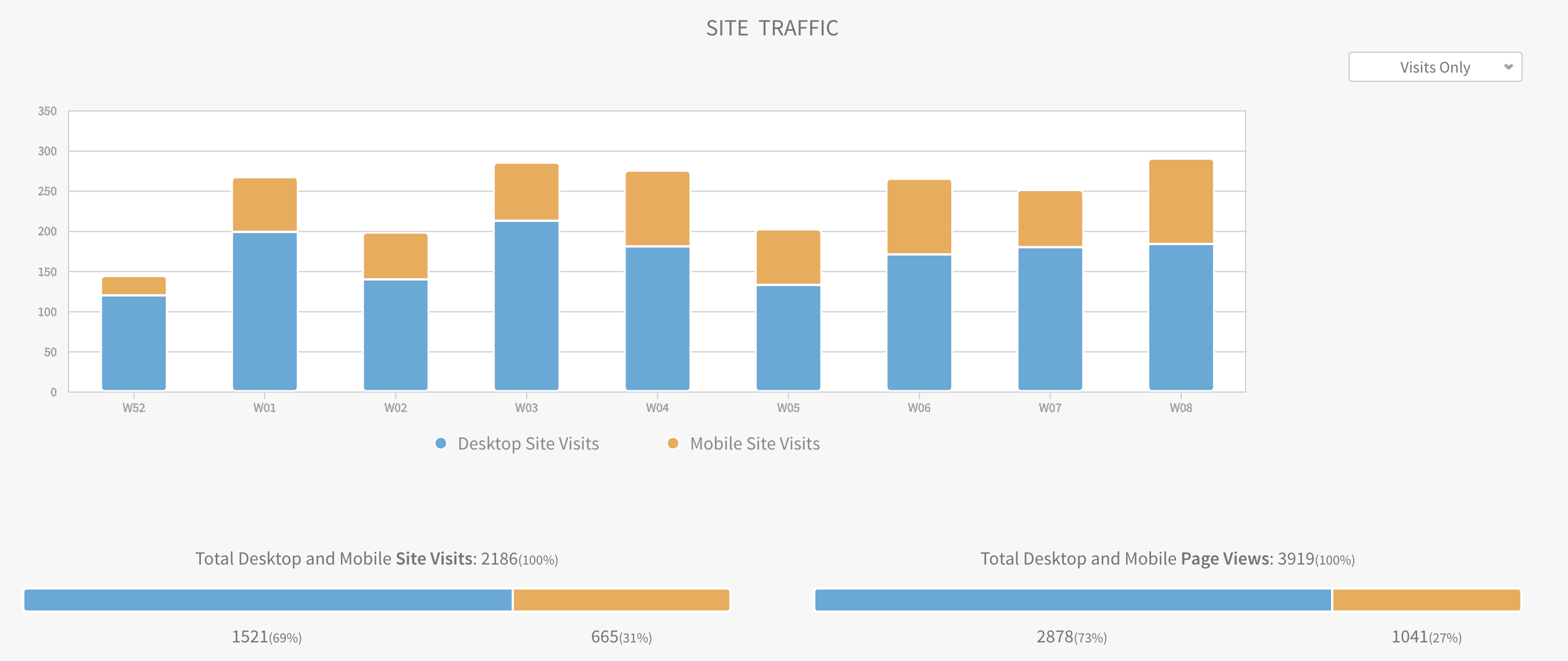
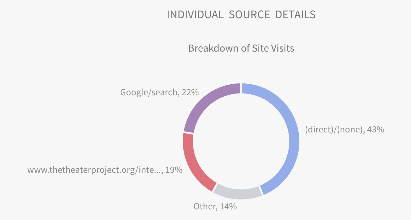
Quantitative: Website Analytics
- Baseline: 3,500 sessions/month
- Homepage: ticket page CTR: 9%
- Ticket purchase conversion: 0.8%
- Bounce rate: 62%
Qualitative: Interview
- What do you usually visit this site?
- What stood out most when you landed on the page?
- Can you walk me through how'd find show details?
- Was anything confusing or unecceary on the homepage?
Design
- Rebuilt homepage hierarchy around
- (1) What’s playing
- (2) Buy tickets
- Navigation updated based on card sort: “Events” + “Tickets” promoted. Reduced competing links in the header
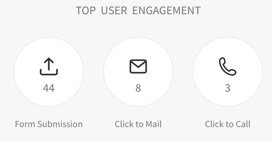
Outcome
Measured over 30 days after launch; conversion defined as completed ticket checkout. Results are directional due to seasonality and small-sample size.
- Homepage → ticket page CTR: 9% → 14% (+55%)
- Ticket purchase conversion: 0.8% → 1.2% (+50%)
- Bounce rate: 62% → 52% (-10 pts)
- Estimated incremental revenue: ~+30 purchases/month
Tools
Figma for design and prototyping, Mural, Qualtrics, UserTesting, ChatGPT
More Cases

Every project starts with a story. I turn those stories into digital experiences that feel effortless and expressive.